


Radarix.ai
What is Radarix.ai?
There’s something powerful about seeing real-time intelligence unfold on a clean map—events, risks, movements—all in one glance instead of scattered across a dozen tabs and news feeds. This platform delivers exactly that: a live, visual radar for open-source intelligence that helps you stay ahead of what’s happening in any region. I’ve watched analysts and researchers light up when they realize they can track emerging situations without drowning in noise. It turns overwhelming data streams into something focused, actionable, and surprisingly intuitive.
Introduction
In today’s world, information moves fast, but making sense of it often doesn’t. Radarix brings clarity by combining live OSINT sources into one visual dashboard. Whether you’re monitoring geopolitical developments, tracking security incidents, or simply staying informed about a specific area, it gives you a single source of truth that updates continuously. What stands out is how it balances breadth of data with clarity of presentation—no overwhelming walls of text, just clean layers you can turn on and off. For professionals who need to act on intelligence rather than just collect it, this feels like a genuine step forward.
Key Features
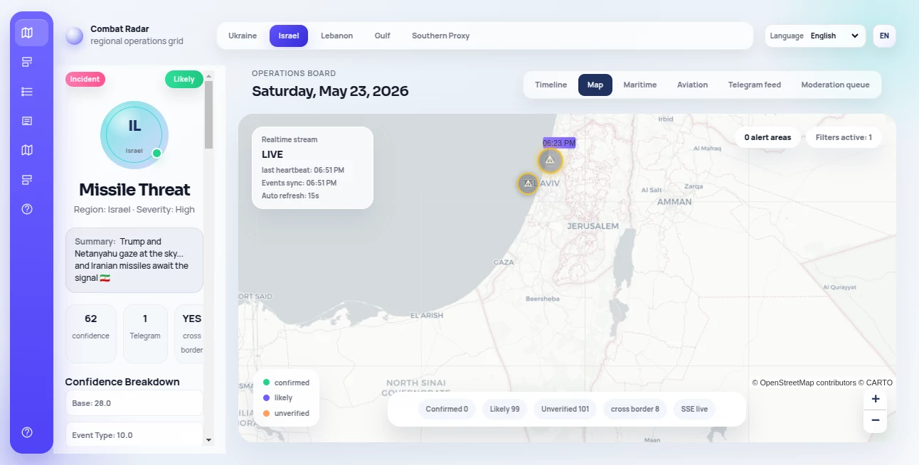
User Interface
The map interface is the star here—clean, responsive, and built for quick scanning. Layers for different data types sit neatly on the side, letting you toggle between events, news, risks, or custom alerts without cluttering the view. Zooming, filtering by region or time, and clicking markers for deeper context all feel natural. It’s the kind of dashboard you can leave open all day without fatigue, which says a lot about how thoughtfully it was designed.
Accuracy & Performance
Data pulls from multiple verified open sources and updates in near real-time. The platform filters noise effectively so you’re not bombarded with irrelevant items. Accuracy stands out especially during fast-moving situations—markers appear quickly with solid context, and historical layers let you understand how events developed. Performance stays smooth even when tracking multiple regions at once, which is rare for data-heavy mapping tools.
Capabilities
Live event tracking, regional risk highlighting, customizable alert zones, historical playback, multi-source verification, exportable reports, and the ability to layer different intelligence categories. You can set personal watch areas that notify you of relevant developments, or explore global patterns across time. It’s built for both quick glances and deeper analysis, making it useful whether you check it once a day or keep it as your primary monitoring screen.
Security & Privacy
Your searches, custom zones, and watchlists stay private to your account. The platform doesn’t sell or share user data, and all connections are properly secured. For analysts, journalists, security teams, or researchers handling sensitive topics, knowing your monitoring activity isn’t being logged or exploited provides important peace of mind.
Use Cases
A security analyst tracks rising tensions in a specific region and gets early alerts before mainstream coverage catches up. A business development team monitors supply chain risks in real time across multiple countries. A journalist sets up watch zones for breaking stories and receives contextual updates as events unfold. An academic researcher explores historical patterns of certain event types across continents. The common thread is people who need timely, trustworthy intelligence without the usual information overload.
Pros and Cons
Pros:
- Beautiful, practical map interface that makes complex data feel manageable.
- Strong balance between real-time updates and meaningful context.
- Custom alerts and zones turn passive monitoring into active intelligence.
- Clean export options for reports and briefings.
- Focused on usability rather than overwhelming you with every possible data point.
Cons:
- Some advanced filtering and historical depth require paid plans.
- Coverage can vary by region depending on available open sources.
Pricing Plans
Free tier gives solid access for casual monitoring and basic alerts. Paid plans unlock higher data resolution, more custom zones, priority updates, advanced filters, and team collaboration features. Pricing stays reasonable for the value—many professionals say the time saved in research and the quality of insights easily justify the upgrade once they start relying on it daily.
How to Use Radarix
Sign up and you’re dropped straight into the interactive map. Start by searching a location or drawing a custom zone. Turn on relevant data layers—news events, security incidents, economic signals, etc. Click any marker for detailed context and source links. Set up alerts for specific keywords or regions, then let the system notify you of developments. Export reports when needed or share specific views with your team. The workflow is designed to feel natural whether you check in once a day or keep it running as a live dashboard.
Comparison with Similar Tools
Many intelligence platforms feel either overly academic (too much raw data) or overly simplified (not enough depth). This one hits a sweet spot: visually clear enough for quick decisions, detailed enough for serious analysis. Where others require steep learning curves or expensive subscriptions, Radarix keeps things accessible while still delivering professional-grade insights. It’s less about collecting everything and more about surfacing what actually matters.
Conclusion
In an age of information overload, having a clean, reliable window into what’s happening matters more than ever. This platform delivers that window with elegance and purpose. It respects your time, sharpens your awareness, and gives you confidence that you’re seeing the real picture rather than just noise. For anyone whose work depends on staying informed—whether professionally or personally—it’s one of those tools that quickly becomes indispensable.
Frequently Asked Questions (FAQ)
How real-time is the data?
Updates come in continuously from multiple sources, with major events appearing within minutes.
Can I set up personal alerts?
Yes—custom zones and keyword alerts make monitoring specific interests effortless.
Is it suitable for teams?
Paid plans include collaboration features and shared views designed for team use.
Do I need technical knowledge to use it?
Not at all—the interface is built for analysts and decision-makers, not just technical users.
AI Research Tool , AI Analytics Assistant .
These classifications represent its core capabilities and areas of application. For related tools, explore the linked categories above.
Radarix.ai Alternatives Product

Reachara

Metal

Goodnotes
Yorph AI

Embedful
Schema Synth

GEO Checker

Surmado

UPDF AI
