


toontone
What is toontone?
There’s a special satisfaction in nailing a color match—dialing in that perfect hue, saturation, and brightness until it just clicks. This game turns that satisfying moment into an addictive daily habit. You look at a target color (or a cartoon character part), tweak three sliders, and get scored on how close you got using real perceptual difference. It’s simple, fast, and strangely rewarding. I’ve caught myself playing “just one more round” during coffee breaks, and my color sensitivity has noticeably improved after a couple of weeks. It’s the kind of fun tool that sneaks in real skill-building without feeling like homework.
Introduction
Most of us think we’re decent at judging colors until we try matching them precisely. Toon Tone makes that challenge enjoyable and surprisingly effective. Built around HSB sliders (Hue, Saturation, Brightness), it tests and trains your visual perception through quick rounds. Whether you play the standard color match, memory mode, or character-based challenges, each game sharpens your eye in a way that translates to real life—better design choices, more accurate photo editing, or simply appreciating color more deeply. It’s approachable for casual players yet deep enough for design enthusiasts who want to level up their eye.
Key Features
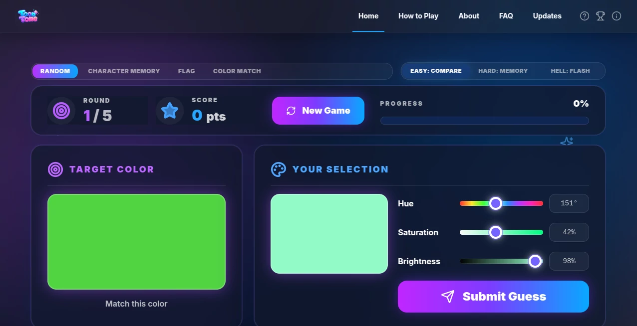
User Interface
The interface is wonderfully clean and distraction-free. A big target color or character part sits on one side, your adjustable preview on the other, with three clear sliders below. No clutter, no unnecessary stats until you submit. The scoring appears instantly with a satisfying animation, and you can jump into the next round immediately. It feels polished yet simple—like a well-designed toy that respects your time and focus.
Accuracy & Performance
The scoring uses ΔE (perceptual color difference), which is the same standard professionals use. This makes the feedback honest and educational rather than arbitrary. Rounds load instantly, and the game runs smoothly even on phones. After playing regularly, you start noticing how your guesses get consistently closer—real, measurable improvement that feels earned.
Capabilities
Multiple modes keep things fresh: standard color matching, memory challenges where the target disappears, flash rounds for speed, and character-based games that add personality. You can choose difficulty levels (Easy, Hard, Hell), track your high scores, and replay specific rounds. It’s flexible enough for a quick 30-second break or a focused 10-minute training session. The variety prevents boredom while steadily building your color intuition.
Security & Privacy
It’s a straightforward browser game with no account required for core play. No data collection beyond basic session stats, and nothing is stored long-term unless you choose to track scores. That lightweight, private feel makes it relaxing—you can play without worrying about profiles, ads, or data tracking.
Use Cases
Design students use it daily to train their eye before critiques. Digital artists warm up with a few rounds before starting client work. Photographers improve their color grading instincts. Casual players treat it like a fun brain teaser during commutes or breaks. Even kids enjoy the character modes while unknowingly building visual skills. It fits anywhere attention to color matters—work, hobby, or pure entertainment.
Pros and Cons
Pros:
- Addictive yet genuinely skill-building gameplay.
- Clean, focused interface that respects your attention.
- Multiple modes and difficulties for all skill levels.
- Instant, meaningful feedback using real perceptual metrics.
- Completely free to play with no aggressive monetization.
Cons:
- Can become very challenging on higher difficulties (which is also the fun part).
- No deep progression system or social features yet.
- Some character rounds can feel slightly easier than pure color ones.
Pricing Plans
The core game is completely free and unrestricted. There may be optional supporter options or future premium modes, but the main experience stays open and enjoyable without any paywalls blocking the fun. It’s refreshing in a world where many simple games push subscriptions hard.
How to Use Toon Tone
Visit the site, pick a mode (standard, memory, character, etc.), and choose your difficulty. Study the target carefully, then adjust the Hue, Saturation, and Brightness sliders until your preview matches as closely as possible. Submit to see your score and how close you got. Review the breakdown if you want to learn, then jump into the next round. Play a few rounds daily and watch your average scores climb over time—it’s that simple and effective.
Comparison with Similar Tools
Other color games often feel either too basic or overly gamified with points and badges that distract from actual skill building. This one keeps the focus on pure visual matching with clean feedback. It strikes a sweet spot between fun and educational that most competitors miss—challenging enough to improve real skills, light enough to play for pure enjoyment.
Conclusion
In our increasingly visual world, training your eye for color is a genuinely useful skill. Toon Tone makes that training feel like play rather than practice. It’s simple, satisfying, and surprisingly effective at sharpening something we all use every day. Whether you want to level up professionally or just enjoy a quick mental break with purpose, it delivers consistent little wins that add up. Give it five minutes and you’ll probably find yourself coming back for more.
Frequently Asked Questions (FAQ)
How is scoring calculated?
Using ΔE (perceptual color difference)—the same standard used in professional color work.
Do I need to create an account?
No—play instantly without signing up. Scores can be tracked locally if desired.
Is it good for beginners?
Absolutely. Easy mode is very approachable, and you’ll improve naturally with each round.
Can I play on mobile?
Yes, it works smoothly on phones and tablets.
What makes the character modes different?
They add fun visuals and context while still training the same core color matching skills.
These classifications represent its core capabilities and areas of application. For related tools, explore the linked categories above.
toontone Alternatives Product
Anime Vangua…

Omoglow

AI Prank Call
AI Baby Dance
videodance

Plottie
DLSS 5 Meme …

Yes No Oracle

Face Shape D…