


















aiboxplot
What is aiboxplot?
AI Box Plot Generator is a browser-based statistics and data visualization tool designed to make box-and-whisker plots quick to create and easy to understand. Instead of setting up a spreadsheet, installing statistical software, or writing code, users can paste a dataset directly into the interface and generate a clean chart in seconds.
The tool goes beyond a basic box plot maker. It supports several statistical visualization formats, multiple dataset comparisons, automatic outlier detection, customizable chart overlays, and AI-powered analysis. Everything is available without an account, advertisements, or watermarks, making it particularly convenient for students, researchers, analysts, teachers, and business users who need a chart without a complicated workflow.
Key Features
- Generate box-and-whisker plots directly in the browser.
- Support for eight chart and statistical visualization types, including box plots, violin plots, histograms, scatter plots, pie charts, Q-Q plots, stem-and-leaf plots, and outlier detection.
- Compare up to 10 datasets side by side.
- Automatic outlier detection using Tukey's fences and IQR-based analysis.
- Adjustable outlier sensitivity at 1.5×, 2×, or 3× IQR.
- Optional jitter, mean, and notch overlays.
- AI-powered statistical insights and distribution summaries.
- Export charts and results in formats such as PNG, SVG, CSV, XLSX, HTML, and Markdown.
- Watermark-free exports suitable for reports, presentations, and academic work.
- Client-side processing designed to keep submitted data on the user's device.
User Interface
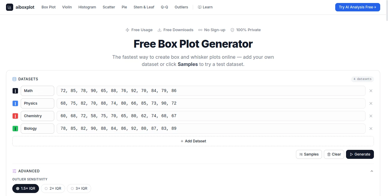
The interface keeps the process pleasantly straightforward. Users can type or paste numerical values separated by commas, spaces, or line breaks, then select the visualization they need. A Samples option is available for quickly testing the workflow before working with real data.
For users who need more control, the Advanced section provides options for outlier sensitivity, jitter, mean and notch overlays, as well as color customization. Adding another dataset is also simple, which makes side-by-side group comparisons much less tedious than building them manually.
Accuracy & Performance
Statistical calculations follow established methods rather than relying on a visual approximation. Quartiles are calculated using linear interpolation based on Hyndman and Fan's method 7, while outliers are identified using Tukey's fences, with the standard threshold based on 1.5 times the interquartile range.
The browser-based workflow also feels fast because chart generation and computation happen locally. A dataset can be pasted into the page and rendered without waiting for a remote processing service. For dependable outlier analysis and more stable quartile estimates, the site recommends having at least 20 data points per dataset, although five points are sufficient to create a basic box plot.
Capabilities
The strongest part of the tool is its flexibility. A user who starts with a simple box plot can move into other statistical views without switching platforms. Violin plots can help reveal distribution shape, histograms show frequency patterns, scatter plots explore relationships between variables, and Q-Q plots provide another way to examine distributions.
Multi-dataset comparison is especially useful when the goal is to compare groups rather than inspect one list of numbers. Up to 10 datasets can be displayed together, with independent labels and visual treatment. The AI analysis feature adds another layer by allowing users to ask questions about their data and receive statistical insights and recommendations.
Security & Privacy
Privacy is one of the more notable aspects of the service. The site states that its calculations run entirely on the client side in the browser, meaning the data entered into the generator is not uploaded to a server for processing. It also states that data is not stored or shared.
This approach is useful when working with classroom exercises, internal business figures, research datasets, or other information that users would rather keep on their own computer. No account is required to use the generator, which also removes an unnecessary registration step for quick statistical work.
Use Cases
Students can use the generator for statistics homework, classroom demonstrations, and assignments where a clear distribution chart is required. Teachers can also use it to demonstrate concepts such as median, quartiles, interquartile range, skewness, and outliers without spending time configuring specialized software.
Researchers and academics can benefit from the clean SVG and high-resolution PNG exports when preparing papers, posters, or presentations. Because SVG graphics remain sharp at different sizes, they can be particularly useful when a chart needs to be incorporated into a publication.
Data analysts can use the multi-dataset functionality during exploratory analysis. For example, performance measurements from several teams or experimental groups can be placed next to each other to reveal differences in median, spread, and unusual observations.
Business professionals can also use box plots to compare KPIs, employee performance measurements, survey responses, or operational data across departments. A quick visualization can make differences that are difficult to spot in a raw spreadsheet much easier to discuss.
Pros and Cons
Pros
- Free to use with no sign-up requirement.
- Fast browser-based chart generation.
- Eight statistical visualization tools in one place.
- Supports comparison of up to 10 datasets.
- Useful outlier detection based on established statistical methods.
- AI-powered analysis can provide additional interpretation of datasets.
- Multiple export formats, including SVG and PNG.
- No watermarks on exported charts.
- Client-side processing provides a strong privacy advantage.
- Responsive interface works across desktop and mobile devices.
Cons
- It is primarily focused on statistical visualization rather than being a complete statistical analysis suite.
- Users performing advanced statistical modeling may still need dedicated statistical software.
- Understanding the output still requires basic knowledge of statistics for responsible interpretation.
Pricing Plans
The service is completely free. There is no sign-up requirement, no advertising, and no watermark added to exported charts. The available functionality includes the chart generators, multi-dataset comparison, AI analysis features, and export options at no cost.
This makes it particularly attractive for students and occasional users who need a professional-looking statistical visualization without committing to a paid analytics platform.
How to Use the Tool
Start by entering or pasting numerical data into the input area. Values can be separated by commas, spaces, or line breaks, so data copied from a spreadsheet can be brought into the tool with very little preparation.
Next, select the desired visualization and generate the chart. If multiple groups need to be compared, additional datasets can be added and displayed together. The Advanced controls can then be used to change outlier sensitivity or enable overlays such as jitter, mean, and notch displays.
Once the visualization looks right, export it in the format that suits the project. SVG is a strong choice for publications and documents where scalable graphics are useful, while PNG works well for presentations and general sharing. Users who want additional interpretation can open the AI analysis functionality and ask questions about their data.
Comparison with Similar Tools
Traditional spreadsheet software can create basic charts, but producing a statistically focused box plot often requires more manual setup. Dedicated statistical applications offer considerably deeper analysis, yet they can be excessive when the immediate goal is simply to visualize a distribution or identify outliers.
This tool sits comfortably between those two options. It offers more statistical-specific functionality than a generic chart builder while keeping the workflow much lighter than a full desktop statistics package. The combination of multiple chart types, adjustable outlier detection, AI analysis, and privacy-focused browser processing makes it a practical choice for quick exploratory work.
It is also worth choosing the visualization according to the question being asked. Box plots are excellent for comparing distributions and spotting outliers, while violin plots can communicate distribution density more clearly. Histograms are useful for frequency and modality, and scatter plots are better suited to examining relationships between two numerical variables.
Conclusion
For anyone who needs to turn numerical data into a useful statistical visualization without wrestling with complicated software, this generator is an appealing option. It combines a very simple input process with features that are normally associated with more specialized tools, including multi-dataset comparison, configurable outlier detection, several chart types, and AI-assisted interpretation.
The no-sign-up model and client-side processing make it especially convenient for quick projects, while watermark-free exports give researchers, educators, analysts, and professionals a practical way to reuse their charts. It is not intended to replace a full statistical package, but for creating, exploring, and presenting distributions in the browser, it offers a focused and capable solution.
Frequently Asked Questions (FAQ)
Is the box plot generator free?
Yes. The service is completely free and does not require an account. The site also states that it has no advertisements or watermarks.
How many data points are needed?
At least five data points are required to create a box plot. For more reliable outlier detection and stable quartile estimates, using 20 or more observations per dataset is recommended.
Can multiple datasets be compared?
Yes. Up to 10 datasets can be added and compared side by side. Each dataset can have its own label and visual treatment.
How are outliers detected?
The default method uses Tukey's fences, with potential outliers identified beyond Q1 − 1.5×IQR or Q3 + 1.5×IQR. The sensitivity can also be changed to 2× or 3× IQR.
Does the tool store my data?
The site states that calculations are performed locally in the browser and that submitted data is not uploaded, stored, or shared.
Can charts be used in academic papers?
Yes. SVG exports are vector graphics that can scale without losing sharpness, making them suitable for publications. PNG exports are also available at high resolution and all exported charts are watermark-free.
What other charts can be created?
In addition to box plots, the platform provides violin plots, histograms, scatter plots, pie charts, Q-Q plots, stem-and-leaf plots, and an outlier detection view.
Does it work on mobile devices?
Yes. The interface is responsive and designed to work on phones, tablets, and desktop computers.
AI Charting , AI Education Assistant , AI Research Tool .
These classifications represent its core capabilities and areas of application. For related tools, explore the linked categories above.

aiboxplot Alternatives Product

UPDF AI

Needle

Vurge

Anti Noise F…

AI Graph Mak…

SciSpace

EZ Grader

Website Traf…

SuperAI