
















Huebert
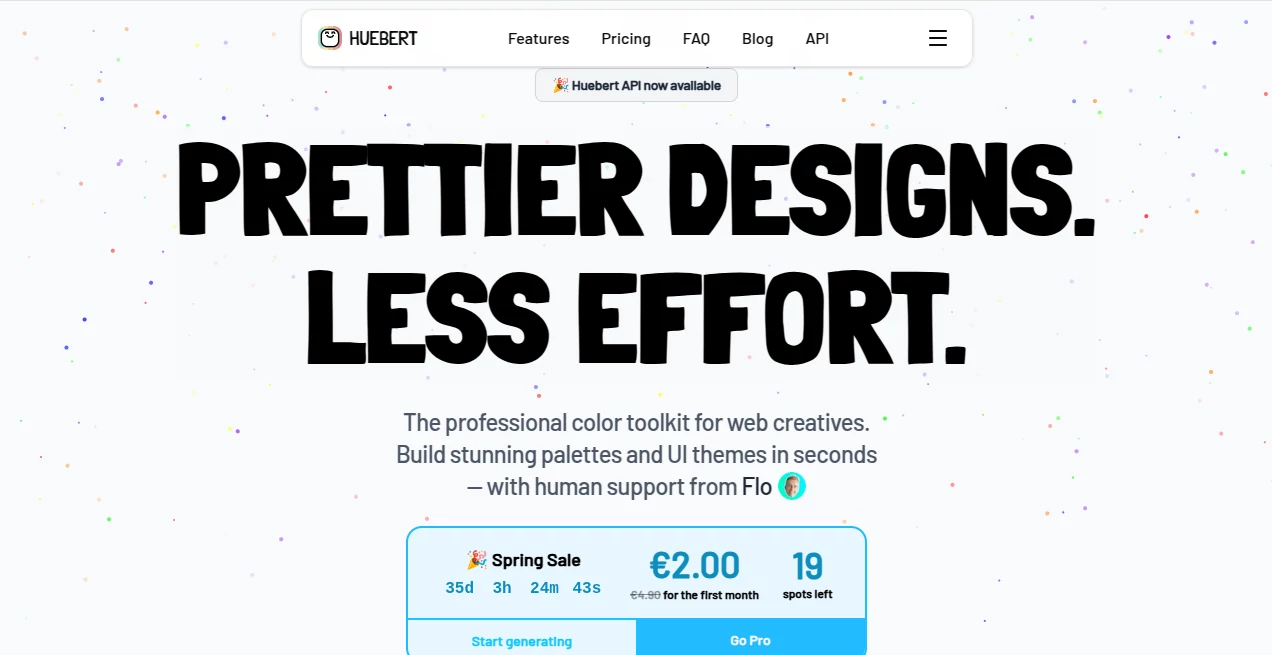
What is Huebert?
There’s a special satisfaction in opening a design file and seeing colors that just feel right—balanced, accessible, and beautiful—without spending hours tweaking sliders or second-guessing yourself. This tool delivers exactly that feeling. It’s a thoughtful color toolkit built specifically for people who create interfaces, websites, and digital products. Whether you’re a solo designer, developer wearing multiple hats, or part of a larger team, it takes the guesswork out of color decisions and leaves you with palettes and themes you’re genuinely proud to ship.
Introduction
Color is one of those things that can make or break a product’s feel. Get it wrong and everything looks slightly off. Get it right and users barely notice—except they feel more comfortable, more engaged. Huebert was created by someone who lived that daily frustration and decided to build something better. The result is a fast, flexible workspace where you can generate professional palettes, check contrast properly, build full UI themes (including shadcn/ui), and export everything you need in seconds. It’s become a daily companion for many creatives who want beautiful results without the usual headache.
Key Features
User Interface
The interface is clean and calming—exactly what you want when working with color. Everything important is visible at a glance: the color wheel, palette builder, live previews, and contrast matrix. You can drag colors around, lock favorites, and see real-time updates across light and dark modes. It never feels overwhelming, even when you’re deep in a complex theme. The joy is in how quickly you can go from blank slate to something production-ready.
Accuracy & Performance
Contrast calculations are rock-solid (WCAG and APCA), color blindness simulations actually help you catch issues early, and the AI suggestions feel intelligent rather than random. Generation is instant, exports are clean, and the tool stays responsive even when you’re working with large palettes or multiple projects. It consistently produces combinations that feel harmonious and accessible—something many other tools only approximate.
Capabilities
You get a full professional toolkit: intelligent palette generation (1–10 colors), high-contrast pair creation, image color extraction, shadcn/ui theme generator with live component previews, personal library for saving projects, and export options for CSS, Tailwind, JSON, SVG, and more. The AI assistance is optional but genuinely helpful when you’re stuck, and everything stays under your control. It’s rare to find one place that covers both creative exploration and production-ready output so well.
Security & Privacy
Your work stays yours. No forced accounts for basic use, no sneaky data collection, and everything you build can be exported and taken elsewhere anytime. For freelancers and agencies handling client projects, that independence and peace of mind matter a lot.
Use Cases
A frontend developer quickly generates a complete Tailwind theme for a new client project and has it looking polished in under ten minutes. A solo founder building their MVP experiments with different brand directions until the colors finally click. A design team maintains consistent palettes across multiple products using the shared library. Even non-designers use the contrast checker before publishing landing pages. It fits naturally into real workflows instead of forcing you to adapt to it.
Pros and Cons
Pros:
- Beautiful, accessible results with minimal effort.
- Excellent shadcn/ui and Tailwind integration.
- Live previews and strong accessibility tools.
- Generous free tier that lets you do real work.
- Human support from the creator—rare and valuable.
Cons:
- Advanced AI features and unlimited usage require Pro.
- Still growing, so some niche export formats may come later.
Pricing Plans
Basic features are free forever—no account even required for core palette work. Pro unlocks AI assistance, the full shadcn/ui generator, personal library, API access, and priority support. The current spring pricing makes the first month especially affordable, and you can cancel anytime. For most freelancers and small teams, the value becomes obvious after the first project.
How to Use Huebert
Head to the palette generator, start typing a base color or let it suggest one. Adjust the number of colors, tweak harmony rules, and watch the live contrast matrix update. Lock colors you love, generate variations, then switch to the theme builder for full UI sets. When you’re happy, export in your preferred format or copy Tailwind variables directly. Save the project if you want to come back later. The whole process feels like sketching with a very smart assistant.
Comparison with Similar Tools
Many color tools are either too basic (random generators) or overly complex (steep learning curves). This one sits in the sweet spot: powerful enough for professionals, approachable enough for quick tasks. The combination of strong accessibility checking, shadcn/ui support, and thoughtful AI makes it stand out from both free utilities and heavier design suites.
Conclusion
Great design isn’t about spending more time on color—it’s about spending time on the right things. This tool removes the friction so you can focus on what actually matters: creating experiences people love. Whether you’re building the next big product or just refreshing an old project, it makes the color part feel effortless and joyful. Prettier designs with less effort isn’t just a tagline—it’s the daily reality here.
Frequently Asked Questions (FAQ)
Do I need an account to start?
No. You can use the core tools immediately without signing up.
Is the Pro plan worth it?
For most people doing regular design or development work, yes—the AI features and full theme tools save significant time.
Can I export for Tailwind or shadcn/ui?
Absolutely—one-click exports make integration seamless.
How good is the AI assistance?
It’s genuinely helpful for generating harmonious palettes and suggesting improvements while still letting you stay in control.
Can I cancel Pro anytime?
Yes, with no long-term lock-in and access until the end of the billing period.