
















What is Get Aspect Ratio?
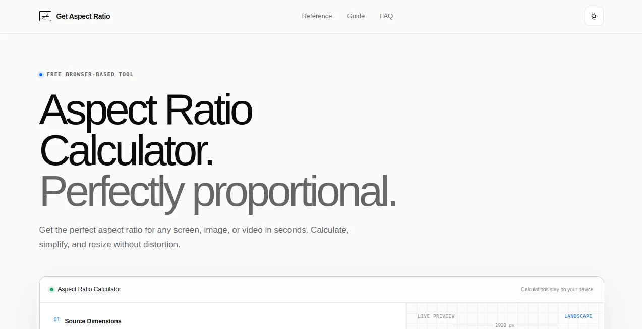
Get Aspect Ratio is a free browser-based tool designed to make aspect ratio calculations and proportional resizing much easier. Instead of working through formulas manually, users can enter the width and height of an image, video, screen, or design and instantly see the simplified ratio, decimal value, and closest standard format.
The real advantage is its simplicity. There is no account to create, no file to upload, and no complicated editing workspace to learn. Everything happens directly in the browser, making it a practical choice for designers, photographers, video creators, developers, marketers, and anyone who regularly works with digital dimensions.
For example, entering 1920 × 1080 immediately produces the familiar 16:9 ratio. If a new width or height is entered, the other dimension is automatically calculated while preserving the original proportions. That small convenience can save surprisingly much time when preparing content for different platforms.
Key Features
- Instant aspect ratio calculation from width and height.
- Automatic simplification using the greatest common divisor.
- Proportional resizing without stretching or distortion.
- Live visual preview showing the resulting shape.
- Decimal ratio and percentage information.
- Closest standard aspect ratio detection.
- Popular presets including 16:9, 4:3, 1:1, 3:2, 21:9, 9:16, 4:5, and 16:10.
- Copy results for convenient use in other applications.
- Shareable calculation links.
- Calculations remain on the user's device.
User Interface
The interface is deliberately straightforward. The calculator separates the process into clear steps, beginning with the source dimensions and moving into proportional resizing. Users can enter pixel width and height, view the simplified ratio, and then adjust either dimension to calculate the matching value.
A live preview provides useful visual feedback by showing whether the selected proportions are landscape, portrait, or square. This is particularly helpful when numbers alone do not immediately communicate how a frame will look.
Accuracy & Performance
Accuracy is one of the strongest aspects of this utility because the calculation is based on the greatest common divisor rather than a rough visual estimate. For instance, 1920 × 1080 is reduced by a common divisor of 120 to produce the exact 16:9 relationship.
The tool also keeps calculations lightweight by performing them directly in the browser. There is no need to upload an image or wait for a remote processing service. For quick dimension checks, the response is effectively immediate.
Capabilities
The calculator covers more than simply identifying a ratio. It can determine proportional dimensions when a target width or height is known, display a visual representation of the frame, and help users compare their dimensions with common standards.
The built-in references are especially useful for everyday production work. Standard examples include 1920 × 1080 for Full HD, 3840 × 2160 for 4K UHD, 1080 × 1350 for a 4:5 Instagram-style portrait, and 1080 × 1920 for vertical video.
Security & Privacy
Privacy is refreshingly simple here. The calculator does not require users to upload files because the calculation only needs numerical dimensions. The site states that calculations stay on the user's device and that no sign-up is required.
This makes the tool convenient for professional environments where users may prefer not to send creative assets or project information to an external processing service just to calculate dimensions.
Use Cases
Designers can use the calculator before exporting graphics to make sure their canvas matches the intended destination. A social media manager can quickly check whether a creative should be square, portrait, or vertical. Video editors can calculate matching resolutions without introducing distortion.
Photographers can also use it when working between common formats such as 3:2 and 4:5. Developers may find the ratio calculations useful when preparing responsive interfaces, media containers, or fixed-size graphics.
Consider a simple workflow: you have a 1920 × 1080 video but need a vertical version. Instead of guessing the appropriate height or width, you can use the ratio information to understand the target proportions and decide whether the project requires cropping, padding, or a redesigned composition.
Pros and Cons
Pros
- Free to use.
- No sign-up required.
- Works directly in a web browser.
- Fast and easy to understand.
- Calculations remain on the user's device.
- Useful presets for common creative formats.
- Supports proportional resizing without distortion.
- Includes a visual preview.
Cons
- It focuses on calculations rather than image editing.
- It does not replace a full graphics or video editing application.
- Users still need to decide whether cropping, padding, or redesigning is appropriate when source and destination ratios differ.
Pricing Plans
The calculator is available free of charge. The site does not require a subscription or account to perform calculations, making it particularly appealing for occasional users who simply need a reliable ratio calculation without committing to another software service.
Because the tool focuses on a specific task rather than a large creative workflow, its free-access model feels appropriate. Someone who needs to check a resolution once can simply open the calculator, complete the calculation, and move on.
How to Use the Calculator
- Open the aspect ratio calculator in your browser.
- Enter the original width in pixels.
- Enter the original height in pixels.
- Read the simplified aspect ratio and decimal value.
- Check the closest standard ratio if needed.
- Enter a new width or height to calculate proportional dimensions.
- Use the live preview to confirm the resulting orientation.
- Copy or share the calculation when the result is ready.
A practical example is 1280 × 720. The dimensions simplify to 16:9. If you then choose 1920 pixels as the new width, the matching height is 1080 pixels, preserving exactly the same proportions.
Comparison with Similar Tools
Many image and design applications can display dimensions, but they often require opening a project, importing an asset, or navigating through a larger editing interface. A dedicated calculator has a different advantage: it removes everything that is not necessary for the calculation.
Compared with manually calculating ratios, the automated approach reduces the chance of arithmetic mistakes. Compared with full design software, it is faster for small jobs where no editing is required. It is best viewed as a focused utility that complements rather than replaces professional creative applications.
Conclusion
For anyone who frequently works with images, videos, screens, social media graphics, or responsive layouts, getting proportions right is a small detail that can prevent much larger problems later. Incorrect ratios can lead to unwanted cropping, stretched content, empty borders, or unnecessary rework.
This calculator handles that particular problem with a clean workflow, instant calculations, useful presets, and proportional resizing. The fact that it is free, requires no account, and keeps calculations on the user's device makes it even easier to recommend for everyday production tasks.
It is not trying to be a complete design suite, and that is precisely its strength. When the only question is “What dimensions should I use?”, a focused calculator can be much more useful than opening a heavyweight application.
Frequently Asked Questions (FAQ)
What is an aspect ratio?
An aspect ratio describes the proportional relationship between the width and height of an image, video, screen, or design. It is normally written using two numbers separated by a colon, such as 16:9 or 4:3.
Is 1920 × 1080 the same as a 16:9 aspect ratio?
1920 × 1080 is a resolution, while 16:9 is its simplified aspect ratio. Dividing both dimensions by 120 produces 16 × 9, so the resolution has a 16:9 shape.
Can I resize an image without distortion?
Yes. By keeping the aspect ratio locked and changing only one dimension, the matching dimension can be calculated proportionally. This helps prevent stretching or squeezing the original content.
What aspect ratio should I use for Instagram?
The appropriate ratio depends on the placement. A 1:1 format works for square content, 4:5 provides a portrait feed format, and 9:16 is commonly used for full-screen Stories and Reels.
What aspect ratio is commonly used for YouTube?
16:9 is the standard widescreen format for regular YouTube videos. A common Full HD resolution is 1920 × 1080, while 9:16 is more suitable for vertical Shorts content.
Can a 4:3 image simply be resized into 16:9?
Not without changing the composition. Proportional resizing preserves the original 4:3 shape. To reach 16:9, you generally need to crop part of the image, extend the canvas, add padding, or redesign the composition.
Does the calculator require an account?
No. The website provides the calculator without requiring users to create an account, making it convenient for quick calculations.
Does it require uploading an image?
No. The calculator works from width and height values, so an image does not need to be uploaded just to determine its aspect ratio.
Is it useful for video dimensions?
Yes. Common video formats such as 16:9 and 9:16 can be calculated and resized proportionally, making the tool useful when preparing dimensions for landscape and vertical video projects.