
🧠 AI Quiz
Think you really understand Artificial Intelligence?
Test yourself and see how well you know the world of AI.
Answer AI-related questions, compete with other users, and prove that
you’re among the best when it comes to AI knowledge.
Reach the top of our leaderboard.


Graph Maker
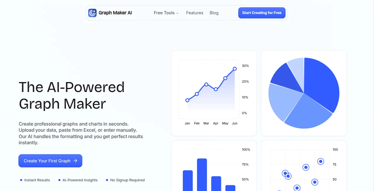
What is Graph Maker?
Staring at a spreadsheet full of numbers and trying to make sense of it with a clunky chart tool can feel like pushing a boulder uphill. This platform flips that frustration on its head. You paste your data—messy or clean—and seconds later you’re looking at a sharp, professional graph that actually tells a story. I’ve had moments where I pasted quarterly sales figures from a client, and the tool not only picked the perfect line graph but also highlighted the upward trend with a little note that made the insight pop. It’s one of those rare tools that feels like it was built by someone who’s actually spent hours fighting bad visuals.
Introduction
Creating graphs shouldn’t require a design degree or half a day of formatting. This tool gets that. It takes whatever data you throw at it—Excel paste, manual entry, even a bit of chaos—and turns it into something clean and meaningful almost instantly. No sign-up walls, no feature overload; just paste, generate, tweak if needed, and go. It’s become a quiet favorite for people who need visuals fast but still want them to look thoughtful—students sketching lab results, marketers showing campaign lifts, small business owners tracking monthly expenses. The AI quietly does the tedious parts (cleaning data, suggesting types, adding smart insights) so you can focus on what the numbers actually mean.
Key Features
User Interface
It’s refreshingly minimal. One big paste box, a generate button, and your graph appears with editing controls right there—no deep menus or confusing side panels. Change colors, add labels, adjust the legend, or swap chart types with a couple of clicks. Everything updates live. It feels like a conversation with a smart assistant rather than wrestling software. First time I used it, I expected the usual learning curve—there wasn’t one.
Accuracy & Performance
The AI is surprisingly sharp at spotting what the data wants to say. It cleans up messy entries automatically, picks sensible scales, and suggests the right chart type instead of forcing you to guess. Generation is fast—usually under ten seconds—and the output looks crisp even when zoomed. In real use, it consistently turns scattered rows into visuals that actually communicate trends, outliers, or comparisons clearly.
Capabilities
Line graphs are live now, with bar, pie, scatter, and more rolling out soon. It handles basic stats and gives quick insights like “this quarter grew 23% over last” or “notice the spike here.” You can edit freely—themes, sizes, legends—and export to PNG, SVG, or JPEG. The real-time updates mean you can experiment without starting over. It’s lightweight but surprisingly capable for everyday data storytelling.
Security & Privacy
Your data never leaves your browser during the main process. Nothing is stored on servers unless you explicitly choose to save or share a link. For anyone cautious about pasting business numbers or personal info, that local-first approach is a big plus—peace of mind without sacrificing speed.
Use Cases
A high school student pastes experiment results and gets a clean line graph plus a quick note on the upward trend—homework done smarter. A small business owner drops monthly revenue numbers and creates a simple bar chart for their next investor update. A content creator quickly visualizes social media growth stats for a blog post. It’s perfect whenever you need a visual that looks intentional but don’t have time to fight formatting.
Pros and Cons
Pros:
- Instant turnaround—data in, good-looking graph out in seconds.
- No sign-up or install needed; just use it.
- Smart data cleaning and type suggestions save real time.
- Clean, editable outputs that don’t look auto-generated.
Cons:
- Line graphs are the main type right now; others are still coming.
- Very complex datasets might need a quick manual tidy first.
Pricing Plans
Completely free right now—no hidden catches, no credit card prompt. Everything from basic graphs to exports and sharing links works without paying. As more chart types roll out, the team has hinted at optional paid tiers for power users, but the core experience stays open to everyone. It’s generous in a way that builds trust fast.
How to Use Graph Maker
Open the page, paste your data (Excel rows, CSV snippet, or type it in). Click Generate. The AI cleans it up, picks a chart type (usually line for time series), and shows the result. Tweak colors, labels, or size if you want. Download as PNG, SVG, or JPEG, or copy a shareable link. That’s it—under a minute from paste to polished visual most times.
Comparison with Similar Tools
Traditional chart builders force you through manual steps and formatting battles. Spreadsheet defaults look dated or overcomplicated. This sits in a sweet spot: smarter suggestions than basic tools, faster than full design suites, and no learning curve. It’s not trying to be everything—just really good at turning raw numbers into visuals you’re proud to share.
Conclusion
Good data deserves to be seen clearly, not buried in ugly defaults. This tool makes that happen without drama or delay. It’s simple, fast, and surprisingly smart—exactly what you want when you just need a graph that works and looks good doing it. Whether you’re prepping a quick slide, supporting a blog post, or tracking personal goals, it quietly raises the bar on what “good enough” can be.
Frequently Asked Questions (FAQ)
Do I have to sign up?
No—use it instantly, no account needed.
What kinds of data work best?
Time series (dates + numbers) shine for line graphs; categorical data works great too.
Can I customize the look?
Yes—colors, labels, legends, sizes, all adjustable right in the preview.
Is my data safe?
Processed in-browser, never stored on servers unless you save/share.
Are there limits?
Free and unlimited for now; future paid tiers may add extras, but basics stay open.
AI Charting , AI Productivity Tools .
These classifications represent its core capabilities and areas of application. For related tools, explore the linked categories above.
Graph Maker details
Pricing
- Free
Apps
- Web Tools
Categories

Graph Maker Alternatives Product

SlideStorm AI

Sourcetable

GenPPT AI

InPage AI

AI Graph Mak…

Flow Veo 3

eesel AI

KwaKwa Cours…

SuperAI