🧠 AI Quiz
Think you really understand Artificial Intelligence?
Test yourself and see how well you know the world of AI.
Answer AI-related questions, compete with other users, and prove that
you’re among the best when it comes to AI knowledge.
Reach the top of our leaderboard.


Webcomparis
What is Webcomparis?
Ever found yourself flipping between two websites, squinting at tabs, trying to spot differences in layout, copy, or design? This little gem changes that entirely. You drop two URLs side by side in one clean view, and suddenly every detail becomes obvious: font choices, spacing, button styles, color palettes, even subtle animations or loading behaviors. I’ve used it to compare landing pages during A/B tests, spy on competitor pricing tables, and help clients understand exactly why one version converts better. It’s simple, visual, and surprisingly addictive—once you start using it, you wonder how you ever did competitive analysis without it.
Introduction
Website comparison used to mean screenshots, manual checklists, or endless tab-switching. This tool eliminates all of that friction. It loads two sites (or more) in a synchronized, side-by-side or overlay view, letting you scroll, hover, and inspect simultaneously. The real breakthrough is how effortless it makes spotting what actually matters: visual hierarchy, copy tone, CTA placement, mobile responsiveness, speed feel, trust signals. For marketers, designers, product managers, and founders, it’s become the fastest way to answer “what are they doing better?” or “how can we stand out?” without losing hours to manual work.
Key Features
User Interface
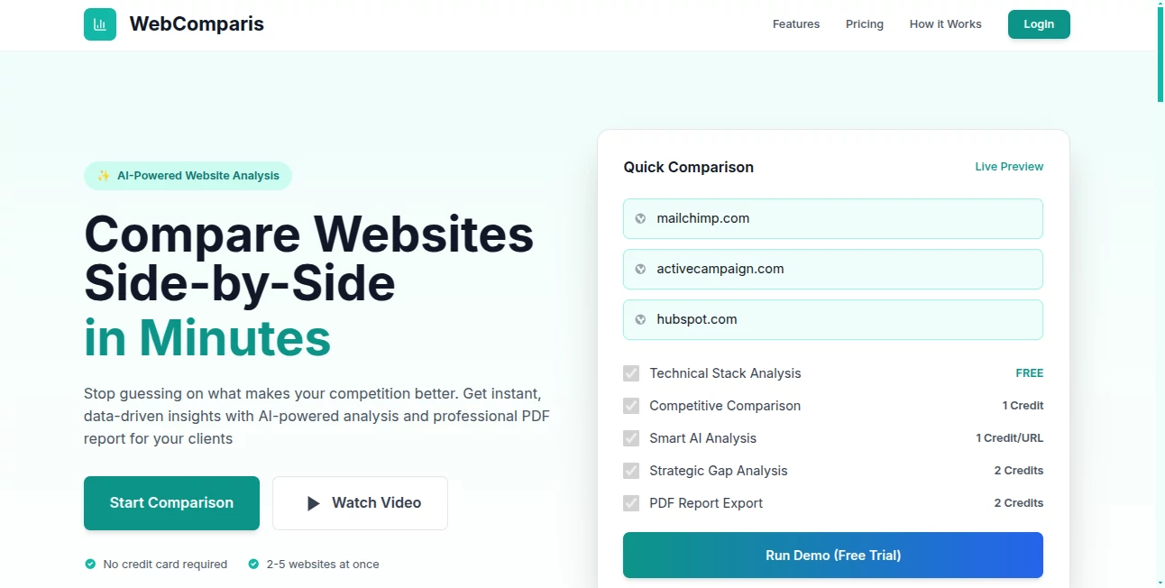
The screen is beautifully split: left and right panes load your chosen sites, with a thin control bar on top for quick switches between side-by-side, overlay, diff highlight, and mobile/desktop views. Scroll sync keeps both pages aligned so you never lose context. Hover over any element and see instant cross-highlighting on the other site. It’s one of those rare interfaces that feels like it was built by someone who’s actually done the job—intuitive, fast, no learning curve.
Accuracy & Performance
Pages render faithfully—JavaScript, CSS animations, dynamic content all work as expected. Sync is tight; scroll one side and the other follows instantly. Diff mode accurately highlights changed text, colors, spacing, and element additions/removals without false positives. Performance holds up even on heavy sites with video backgrounds or complex carousels. It’s reliable enough for client presentations or internal reviews where pixel-perfect comparison matters.
Capabilities
Side-by-side comparison, overlay mode with opacity slider, visual diff highlighting, synchronized scrolling, mobile & desktop viewport switching, element inspector (hover to see class/ID/styles), screenshot capture of both views, and shareable comparison links. You can compare any public URL—no login or installation needed. It’s perfect for A/B analysis, competitor research, redesign planning, UX audits, or simply showing stakeholders “here’s what changed and why it matters.”
Security & Privacy
No login required for basic use means no account data is collected unless you choose to save comparisons. Sites load directly from their own servers—nothing is proxied or stored long-term. Comparison links are shareable but don’t expose sensitive info beyond what’s publicly visible on the pages. For agencies and teams comparing client sites or internal staging environments, that minimal footprint feels safe and professional.
Use Cases
A growth marketer compares their landing page against the top three competitors and instantly sees why one rival’s CTA button converts better (bolder color + shorter copy). A product designer audits a redesign by overlaying old vs new versions to show stakeholders exact improvements in spacing and hierarchy. An agency prepares a competitive analysis deck by capturing clean side-by-side screenshots of pricing pages. A founder benchmarks their MVP against category leaders to prioritize the next feature sprint. Wherever visual comparison drives decisions, it saves time and eliminates guesswork.
Pros and Cons
Pros:
- Instant visual clarity—no more tab-flipping or screenshot stitching.
- Overlay + diff modes reveal changes that screenshots alone miss.
- Works on any public URL—zero setup or permissions needed.
- Synced scrolling and hover inspection make deep comparison effortless.
- Shareable links let teams discuss the exact same view in real time.
Cons:
- Very heavy JavaScript sites can occasionally load slower in split view.
- Private or login-protected pages can’t be compared (expected limitation).
- Advanced features like video recording or annotations are still in development.
Pricing Plans
Basic comparison is free and unlimited for personal use—more than enough for most quick checks. Pro plans add unlimited saved comparisons, team sharing, high-res screenshot exports, priority support, and ad-free experience. Pricing stays reasonable—many users say one month pays for itself after a single client presentation or A/B test that leads to better conversions. Flexible enough for freelancers, agencies, or in-house teams alike.
How to Use WebComparis
Enter two URLs in the side-by-side input fields (or paste one and use the “Compare with” button). Hit enter and watch both sites load next to each other. Scroll to sync, hover elements to highlight matches, switch to overlay mode to see differences with transparency, or turn on diff highlighting for instant visual change detection. Take screenshots directly from the tool or share the comparison link with your team. For quick audits, it’s usually under two minutes from start to insight.
Comparison with Similar Tools
Traditional screenshot tools give you static images; this gives you live, interactive comparison. Browser dev tools let you inspect one page at a time—this shows two simultaneously with synced behavior. Other comparison extensions often lack diff highlighting or smooth overlay. It combines the best of visual diff tools with real-time browsing, making it the clear choice when understanding “what’s different and why it matters” is the goal.
Conclusion
Great design decisions often come from seeing clearly what others are doing right (or wrong). This tool makes that seeing part effortless, fast, and accurate. Whether you’re benchmarking competitors, auditing your own site, preparing client recommendations, or just satisfying curiosity, it turns vague “it feels different” into concrete, actionable insight. In a world drowning in tabs, having two sites living side by side with perfect sync is surprisingly liberating. Once you use it, going back to old methods feels like stepping backward in time.
Frequently Asked Questions (FAQ)
Do both sites have to be public?
Yes—only publicly accessible URLs work. Password-protected or staging sites won’t load.
Can I compare more than two sites?
Currently focused on two-way comparison for clarity; multi-site view is in exploration.
Is there a limit on free comparisons?
Unlimited free use for basic side-by-side and overlay; paid unlocks extras like saved links and exports.
Does it capture dynamic content?
Yes—JavaScript, animations, and interactive elements load and behave normally in both panes.
Can I share comparisons with clients?
Absolutely—unique shareable links let anyone view the exact same synced comparison.
Other .
These classifications represent its core capabilities and areas of application. For related tools, explore the linked categories above.
Webcomparis details
This tool is no longer available on submitaitools.org; find alternatives on Alternative to Webcomparis.
Pricing
- Free
Apps
- Web Tools
Categories

Webcomparis Alternatives Product

Bulletin
Pixel Flow L…

PetShard

Judgement Ta…

AI For Devel…

Sound Level …

MCP DXT Serv…

grow a garde…

Free AI Dire…