
🧠 AI Quiz
Think you really understand Artificial Intelligence?
Test yourself and see how well you know the world of AI.
Answer AI-related questions, compete with other users, and prove that
you’re among the best when it comes to AI knowledge.
Reach the top of our leaderboard.


ChartGen
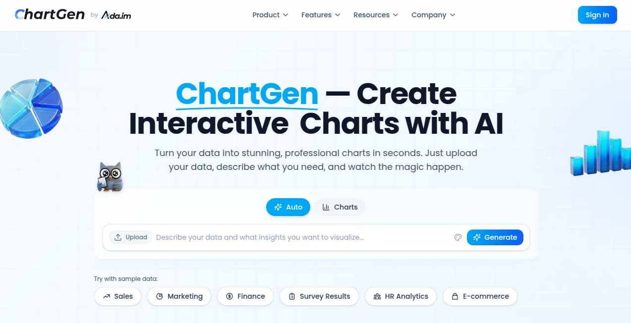
What is ChartGen?
There's something genuinely satisfying about watching raw numbers transform into a clean, insightful visual that tells a story at a glance. This tool nails that feeling every time—upload a spreadsheet or just paste some data, toss in a casual description of what you're after, and seconds later, you've got a polished chart that looks like it came from a design pro. I've used it for quick client reports, and the way it picks the right style and colors without me fiddling endlessly? It's a quiet game-changer that saves hours and makes even messy data look sharp.
Introduction
Data visualization doesn't have to be a slog through complicated software or endless tweaks. This platform flips that on its head, letting you chat with your data in plain English to pull out bar graphs, lines, pies, or whatever fits best. What draws people in is the sheer speed and smarts—it reads your files, spots patterns, and suggests aggregations like sums or averages without you spelling it out. With a free tier that's actually useful and pro options for heavier lifts, it's built for everyone from solo analysts crunching sales figures to teams syncing live feeds. Folks who've switched swear by the time it frees up, turning what used to be an afternoon chore into a coffee-break win.
Key Features
User Interface
It's refreshingly straightforward: a big upload area for CSV or Excel, a spot to paste numbers, or hooks to Google Sheets and beyond. Type something like "show monthly sales by product as a bar chart," and the preview pops up instantly, with sliders for colors and labels that feel intuitive rather than overwhelming. I appreciate the dozen or so preset themes—think crisp navy or vibrant teal—that give everything a professional polish without hunting for hex codes.
Accuracy & Performance
The AI here really listens, auto-detecting dates, categories, and values to avoid those silly mismatches that waste time. Generations fly in under five seconds on average, even with decent-sized datasets, and the results hold up—clean lines, accurate scales, no weird overlaps. From my own runs, it rarely needs a second prompt, nailing the intent first go and keeping things snappy for quick iterations.
Capabilities
Nine solid chart types cover most needs—bars, lines, pies, areas, scatters, heatmaps, combos, waterfalls, funnels—with smart aggregations and real-time sync if you're linked to live sources. Exports hit PNG for quick shares, SVG for scalability, or PDF for reports, all watermark-free on paid plans. The natural language bit is gold: describe trends or comparisons casually, and it handles the heavy lifting on fields and styling.
Security & Privacy
Data gets processed in the moment and isn't stashed long-term, backed by solid compliance like SOC 2 and full encryption. No third-party peeks, just straightforward handling that lets you work with sensitive numbers confidently. It's the kind of behind-the-scenes reliability that builds trust, especially for business users sharing client metrics.
Use Cases
A marketer I know pulls campaign spend versus revenue into a combo chart for board meetings, spotting ROI dips instantly. Finance folks track quarterly growth with waterfall views that highlight wins and slips clearly. E-commerce owners visualize funnel drop-offs to tweak checkout flows, while educators turn survey results into pies that make class discussions pop. It's versatile enough for daily dashboards or one-off insights that turn numbers into narratives.
Pros and Cons
Pros:
- Lightning-quick from data to done, no steep setup.
- Smart suggestions that often get it right first try.
- Professional themes that elevate basic data beautifully.
- Generous free access for casual or testing needs.
Cons:
- Free exports limited to PNG, with watermarks possible.
- Very large datasets might need trimming for best speed.
Pricing Plans
Dive in free with 50 charts a month and core types—no card required, just solid basics to get hooked. Premium unlocks unlimited runs, full exports like SVG and PDF, plus team shares through the connected suite. It's priced approachable, scaling as you grow without surprise jumps, making the leap feel worth it for frequent flyers.
How to Use ChartGen
Load your data—paste a table, upload a file, or link a sheet—then jot a simple request like "compare regional sales over time with lines." Watch it build the chart, tweak colors or aggregations in the side panel if needed, and export your pick. For live stuff, connect once and refresh as numbers roll in. It's that easy loop that turns occasional users into regulars.
Comparison with Similar Tools
While some require manual drags or code snippets, this one's natural language edge cuts straight to the good stuff, often smarter on intent than rigid templates elsewhere. It balances free generosity with pro polish better than many, skipping bloat for focused, beautiful outputs that feel tailored rather than generic.
Conclusion
Turning data into visuals shouldn't feel like work—this tool makes it feel like play, delivering charts that inform and impress without the usual grind. It's the thoughtful companion for anyone wrestling numbers into stories, proving simple smarts can yield standout results. Give it a spin with your next dataset; the clarity might just surprise you.
Frequently Asked Questions (FAQ)
What data formats work?
CSV, Excel, pasted tables, or direct links to sheets and databases.
How many chart styles?
Nine core types with variations, plus a dozen elegant color themes.
Exports on free?
PNG yes, with upgrades for SVG and PDF.
Real-time updates?
Connect live sources for automatic refreshes as data changes.
Safe for business data?
Fully compliant with strong encryption and no long-term storage.
AI Charting , AI Data Mining , AI Productivity Tools , AI Diagram Generator .
These classifications represent its core capabilities and areas of application. For related tools, explore the linked categories above.
ChartGen details
This tool is no longer available on submitaitools.org; find alternatives on Alternative to ChartGen.
Pricing
- Free
Apps
- Web Tools
Categories

ChartGen Alternatives Product

PineBill

Miro

SlideStorm AI

Chrome Sidek…
David One

Kaamfu

YouMind

VisualGPT

photo to URL
