
🧠 AI Quiz
Think you really understand Artificial Intelligence?
Test yourself and see how well you know the world of AI.
Answer AI-related questions, compete with other users, and prove that
you’re among the best when it comes to AI knowledge.
Reach the top of our leaderboard.


UX Pilot AI
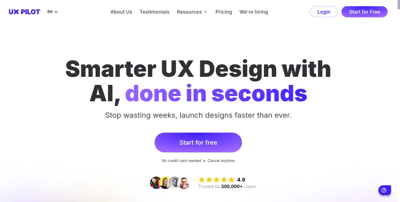
What is UX Pilot AI?
Imagine dropping your wireframe or prototype into a tool and getting feedback that feels like it came from a seasoned senior designer who’s worked on dozens of big projects. That’s exactly what this does—it scans your design, calls out real issues, and suggests thoughtful fixes without the ego or vague comments you sometimes get from humans. I’ve used it on a client dashboard that was feeling clunky, and within minutes it spotted three usability blockers I’d completely missed after staring at the screen for hours. It’s like having a second pair of eyes that never gets tired.
Introduction
This tool came out of the frustration every designer knows too well: you’re deep in a project, you’ve looked at the same screens a hundred times, and you’re blind to the obvious problems. It uses AI trained on real UX principles and thousands of real-world audits to give you objective, actionable insights fast. No fluff, no “make it pop” nonsense—just clear, prioritized feedback that actually helps you improve the experience. Designers who’ve tried it say it’s like having a UX mentor in their pocket, available 24/7 and never too busy to review your work.
Key Features
User Interface
The interface is refreshingly simple: upload your screenshot or Figma link, and within seconds you’re presented with a clean, scannable report. Issues are grouped by severity, with visual callouts directly on the design. You can toggle between “quick scan” for surface-level stuff and “deep dive” for more nuanced problems. It’s built for designers who hate bloated tools—everything you need is right there, no hunting through menus.
Accuracy & Performance
The feedback is surprisingly spot-on, especially for common patterns like form usability, color contrast, and information hierarchy. It’s not perfect (no AI is), but it catches 80–90% of what a human reviewer would flag, and it does so in under a minute. I’ve run the same designs through it multiple times and the results are consistent—same issues, same priority, same clarity.
Capabilities
It handles static screens (Figma, Sketch, screenshots), interactive prototypes, and even live websites. It flags accessibility issues, cognitive load problems, visual hierarchy, and mobile responsiveness. You can ask follow-up questions like “Why is this button confusing?” or “How would you fix this flow?” and it responds with detailed reasoning. It’s not just a checklist tool—it actually understands context and explains its thinking.
Security & Privacy
Your designs stay private. Uploads are processed securely, and nothing is stored unless you explicitly choose to save it. For agency work or client projects, this matters a lot—nobody wants their unreleased designs floating around.
Use Cases
Solo designers use it as a pre-review checkpoint before showing work to clients or stakeholders. Agencies run it on every major deliverable to catch issues early and reduce revision rounds. Product teams use it during sprint reviews to make sure new features don’t break existing flows. Even students and bootcamp grads swear by it for portfolio pieces—nothing looks worse than obvious UX flaws in a hiring review.
Pros and Cons
Pros:
- Fast, consistent feedback that catches things you’ve become blind to.
- Visual callouts make issues impossible to miss.
- Follow-up questions let you dig deeper on tricky problems.
- No learning curve—upload and go.
Cons:
- Still misses some very nuanced or brand-specific issues.
- Free tier is limited; heavy users will need a paid plan.
Pricing Plans
Free tier gives you a handful of reviews per month—enough to get a feel for it. Paid plans start around $10/month for unlimited scans and priority support. There’s a team plan for agencies that includes collaboration features and shared project history. Worth every penny if you’re shipping designs regularly.
How to Use It
Sign up, upload a screenshot or paste a Figma link, and wait about 30 seconds. You’ll get a report with highlighted issues and explanations. Click on any issue to see it marked on the design. Ask follow-up questions in the chat if you need more detail. Export the report as PDF for client presentations or team handoffs. I usually run it mid-design and again before final delivery—catches most problems early and gives me confidence at the finish line.
Comparison with Similar Tools
Unlike generic accessibility checkers that just flag contrast ratios, this tool actually understands UX principles and gives context-aware feedback. Compared to human reviews, it’s faster, cheaper, and available 24/7—though it can’t replace deep strategic conversations. It’s not trying to compete with senior designers; it’s trying to make sure you don’t ship obvious mistakes.
Conclusion
This tool has become one of those “I can’t believe I worked without it” essentials for me. It doesn’t replace human judgment, but it catches the things we all miss when we’re too close to our own work. If you’re designing interfaces regularly, it’s one of the smartest investments you can make. It saves time, reduces revisions, and helps you ship better experiences—quietly and consistently.
Frequently Asked Questions (FAQ)
Does it work with prototypes or just static screens?
It works best with static screens, but you can upload individual frames from prototypes and get solid feedback.
How accurate is the feedback?
Very good at catching standard UX issues (hierarchy, contrast, affordances). Less reliable on highly custom or brand-specific problems.
Can I share reports with clients?
Yes—export as PDF with your branding and notes.
Is my design data safe?
Yes, uploads are processed securely and not stored unless you choose to save them.
What file types are supported?
PNG, JPG, and direct Figma links are the most reliable.
AI Design Assistant , Photo & Image Editor , AI Design Generator , AI Product Description Generator .
These classifications represent its core capabilities and areas of application. For related tools, explore the linked categories above.
UX Pilot AI details
This tool is no longer available on submitaitools.org; find alternatives on Alternative to UX Pilot AI.
Pricing
- Free
Apps
- Web Tools
Categories
UX Pilot AI Alternatives Product

Pixora

Niji V7

AI Age Progr…

ImgEnhancer

Banana Promp…

XIMAGIN

HD Photo Con…

Nano Banana …

Z image AI