
🧠 AI Quiz
Think you really understand Artificial Intelligence?
Test yourself and see how well you know the world of AI.
Answer AI-related questions, compete with other users, and prove that
you’re among the best when it comes to AI knowledge.
Reach the top of our leaderboard.


QuickGraph AI
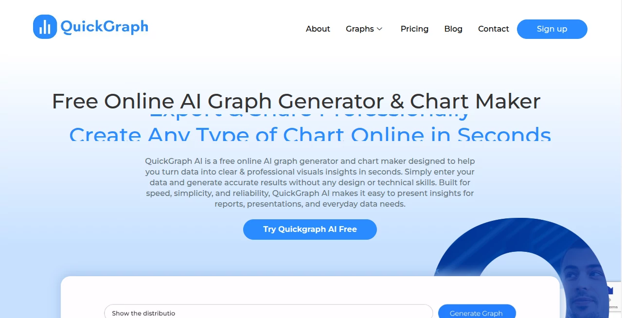
What is QuickGraph AI?
There’s something deeply satisfying about watching raw numbers transform into a clean, insightful chart that actually tells a story. This tool makes that happen almost too easily. Paste a messy spreadsheet, type a question like “show me revenue growth by quarter,” and seconds later you get a polished visualization—colors that make sense, labels that don’t overlap, axes that feel balanced. I’ve seen startup founders go from “I hate making slides” to “look at this dashboard I just built” in the time it takes to brew coffee. It’s the kind of shortcut that makes data feel approachable instead of intimidating.
Introduction
Data lives everywhere—spreadsheets, CSVs, Google Sheets, even plain text—but turning it into something people actually understand is still painful for most. This platform removes the friction. No dragging columns, no fighting with chart settings, no “why does this bar look weird?” moments. You describe what you want in everyday language, and it builds the right chart type with smart defaults. It’s become a quiet favorite among marketers who need quick social graphics, analysts who want to explore trends fast, and teachers who want students to see patterns instead of just numbers. The best part? It doesn’t dumb things down—it just gets the busywork out of the way so the insight can shine.
Key Features
User Interface
The screen is calm and focused: a large text box where you type your question or paste data, a preview pane that updates live as you refine, and a sidebar of suggested chart types and tweaks. No toolbars full of icons you never use. Everything feels intentional—colors are harmonious by default, fonts are readable, legends don’t crowd the plot. Beginners finish their first chart in under a minute; experienced users appreciate how little they have to fight the interface to get exactly what they envision.
Accuracy & Performance
It reads messy data intelligently—skips blank rows, guesses date formats, handles currency symbols, and rarely misinterprets what column is what. Chart suggestions are almost always spot-on for the question asked. Generation is fast (usually 2–8 seconds), and outputs are crisp at any size—perfect for presentations, reports, or social posts. The model understands context too: ask for “year-over-year growth” and it automatically calculates percentages and adds trend lines. That level of thoughtfulness is rare.
Capabilities
Bar, line, area, pie, donut, scatter, bubble, radar, heatmap, treemap, funnel, gauge—plus combinations like dual-axis or stacked charts. Supports time-series, categorical, financial, survey data, and more. You can ask for annotations, forecasts, comparisons, percentage views, or custom colors. Exports include PNG, SVG, PDF, and embed codes for websites. It also suggests insights: “this spike correlates with X event” or “outlier in Q3 worth investigating.” It’s a full data-to-story bridge in one place.
Security & Privacy
Your data never leaves your session unless you explicitly export or share. No account required for basic use, so nothing gets tied to a profile. Paid plans add saved projects with end-to-end encryption and private sharing links. For sensitive business numbers or student grades, that clean, contained approach feels right.
Use Cases
A marketing manager pastes last quarter’s campaign data and asks for “ROI by channel”—gets a clean bar chart ready for the Monday meeting. A teacher drops survey results from class and asks “show student satisfaction trends”—suddenly parents see clear visuals at conferences. A startup founder turns monthly revenue numbers into a growth chart for investor decks. A blogger creates engaging infographics from public datasets without spending hours in design software. Wherever data needs to be understood quickly and beautifully, it quietly saves the day.
Pros and Cons
Pros:
- Feels like talking to a smart designer who already knows what looks good.
- Handles ugly real-world data without complaining or breaking.
- Suggestions and auto-insights save time and spark new questions.
- Exports look professional out of the box—no awkward cropping needed.
- Free tier is genuinely useful—enough for regular light use.
Cons:
- Very custom or niche chart types may need manual tweaking in another tool.
- Unlimited saves, exports, and advanced features sit behind paid plans.
- Large datasets (thousands of rows) can slow generation slightly.
Pricing Plans
Free tier covers casual use—several charts per day, basic exports, no watermarks on most outputs. Paid plans unlock unlimited generations, saved projects, high-res exports, private sharing, advanced chart types, and priority processing. Pricing is modest—many small teams say one month is less than they used to spend on design freelancers for a single quarterly report.
How to Use QuickGraph
Paste your data (CSV, Excel snippet, or just typed numbers) into the input area. Write a natural question: “show monthly active users growth,” “compare revenue by region,” “what’s the trend in customer acquisition cost.” Hit generate. Browse suggested chart types or tweak with plain English (“make it a stacked bar,” “add forecast line”). Preview, adjust colors or labels if desired, then export as PNG, SVG, or embed code. For recurring reports, paid users save the query and refresh data later. It’s fast enough to iterate several versions in one sitting.
Comparison with Similar Tools
Traditional chart makers require manual setup and design decisions that eat time. Many AI charting tools produce generic visuals or struggle with real messy data. This one combines natural-language ease with thoughtful defaults and smart data handling, delivering results that look intentionally designed rather than auto-generated. It sits in a sweet spot: powerful enough for serious analysis, approachable enough for non-technical users.
Conclusion
Data should inform and inspire, not frustrate. This tool quietly removes the friction between numbers and understanding, letting anyone turn raw information into visuals that actually communicate. When your next presentation, report, or social post looks sharper and clearer because of a 30-second interaction, you realize how much creative and decision-making power that unlocks. For teams, creators, educators, or founders who live in spreadsheets, it’s the kind of daily companion that quietly makes everything better.
Frequently Asked Questions (FAQ)
How much data can I paste?
Thousands of rows comfortably—most common datasets fit easily.
Do I need to clean my data first?
Not usually—it handles missing values, mixed formats, and messy headers well.
Can I customize colors and fonts?
Yes—paid plans unlock full palette control and brand font uploads.
Are exports watermark-free?
Free tier has a small watermark on most outputs; paid removes it completely.
Can I save my charts for later?
Yes—paid plans let you save queries, data connections, and chart versions.
AI Data Mining , AI Spreadsheet , AI Analytics Assistant , AI Design Generator .
These classifications represent its core capabilities and areas of application. For related tools, explore the linked categories above.
QuickGraph AI details
This tool is no longer available on submitaitools.org; find alternatives on Alternative to QuickGraph AI.
Pricing
- Free
Apps
- Web Tools
Categories

QuickGraph AI Alternatives Product

Banana AI

string art g…

SeoWebChecker

Nano Banana 2

Aiso

Just Christm…

AI Image Edi…

Sourcetable

Best AI SVG …